Spowers Architects
Client:
Spowers Architects
Spowers Architects
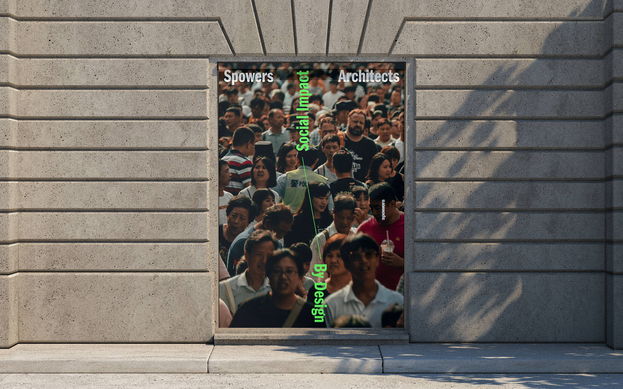
Spowers Architects are a collective of architects, designers, and makers headquartered in Melbourne. Connected by a shared vision, they create spaces for people to live in and use, not guided by arbitrary or imposed style. People-focused, their approach to architecture is high performance, to align with their single-minded design philosophy of delivering and responding to social, environmental and economic factors.
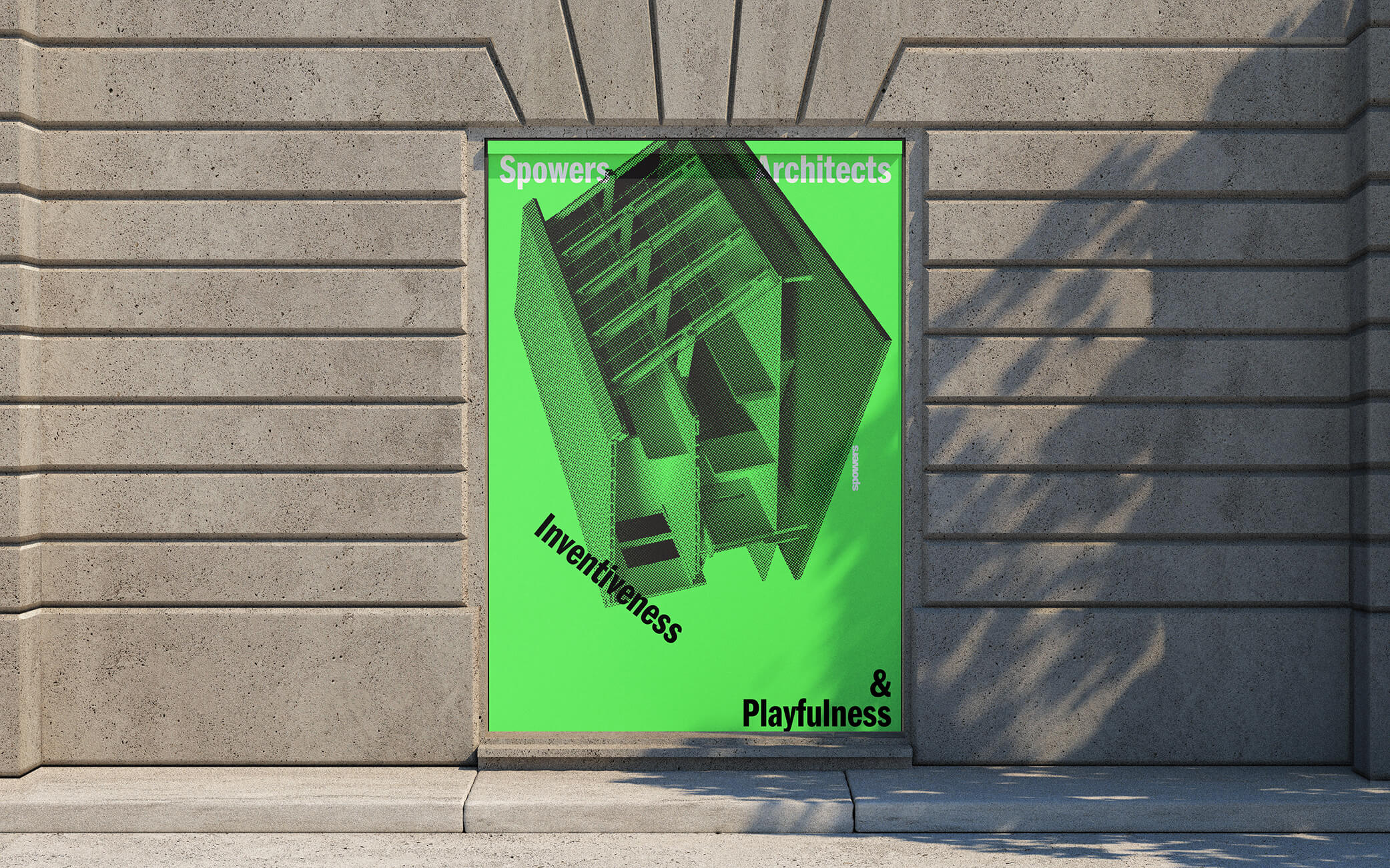
Our approach for Spowers Architects was to establish a distinctive identity that would launch them as a competitive player in the national and international market.
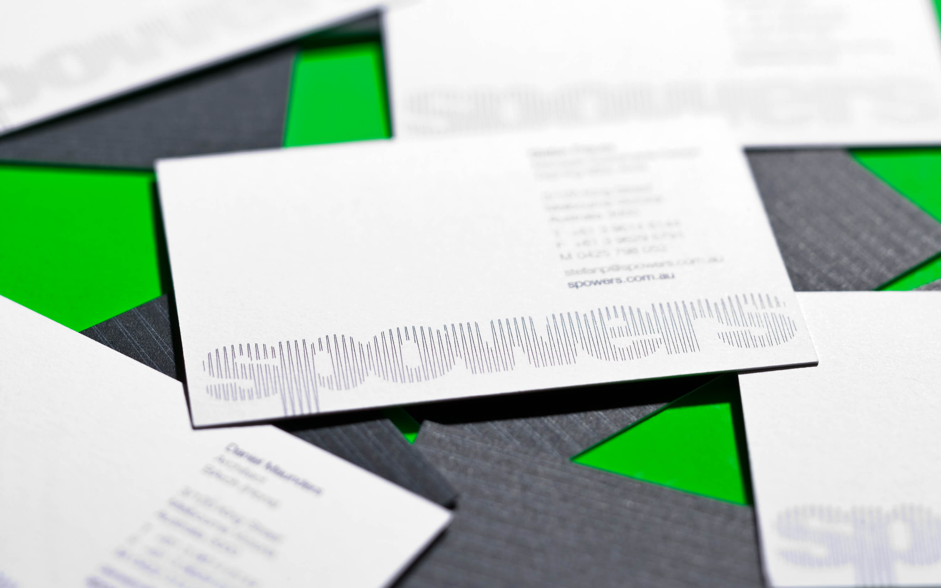
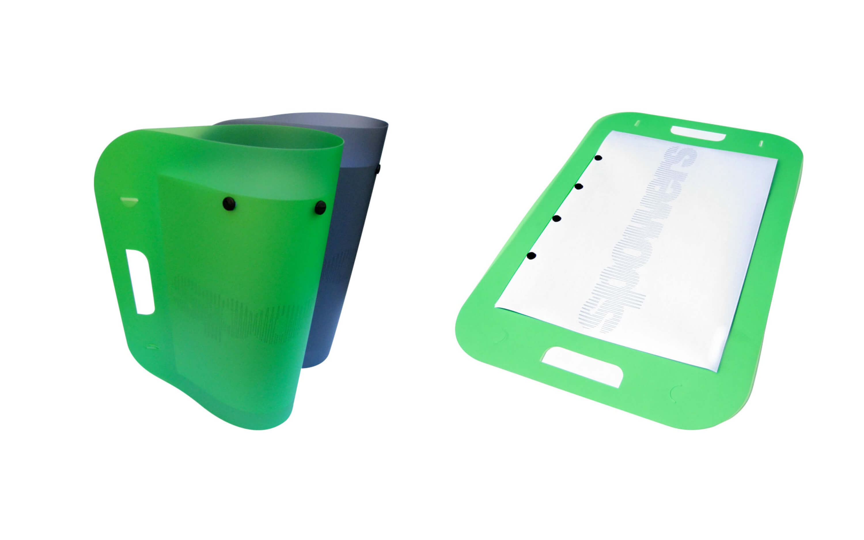
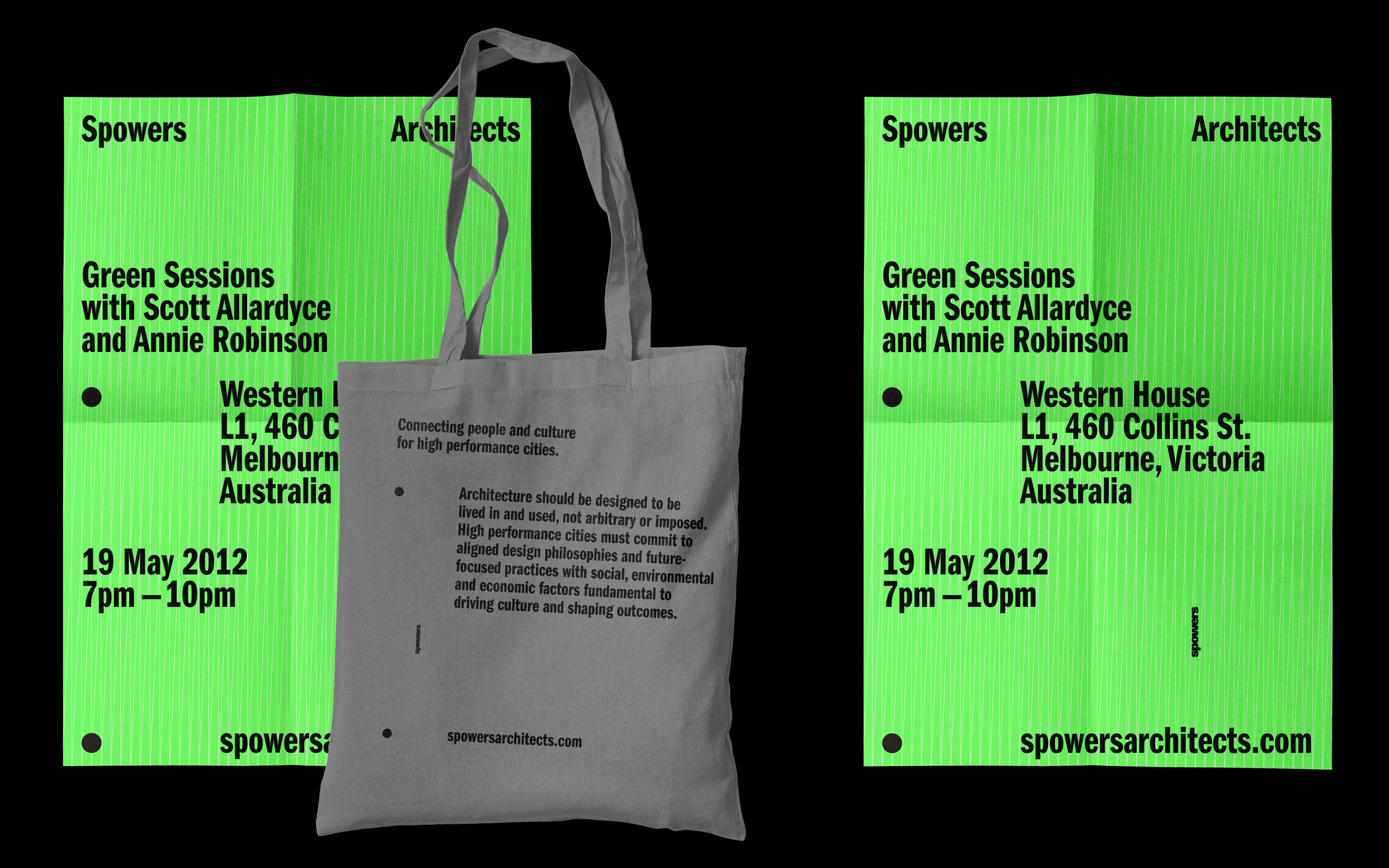
Uniquely typographic, the linear stroke becomes the building blocks to create the form of the company name. Achromatic, emotionally cool and analytical, the brand serious and sober in its professional form, is added additional vibrancy and youth in specific applications through the managed introduction of a fluorescent green.
Awards
Tokyo Type Director's Club — Typography
New York Type Director's Club — Typography
AGDA Awards — Identity
Designed & completed at Chimera Design
Photography: Parallax Photography
Our approach for Spowers Architects was to establish a distinctive identity that would launch them as a competitive player in the national and international market.
Uniquely typographic, the linear stroke becomes the building blocks to create the form of the company name. Achromatic, emotionally cool and analytical, the brand serious and sober in its professional form, is added additional vibrancy and youth in specific applications through the managed introduction of a fluorescent green.
Awards
Tokyo Type Director's Club — Typography
New York Type Director's Club — Typography
AGDA Awards — Identity
Designed & completed at Chimera Design
Photography: Parallax Photography